Problem
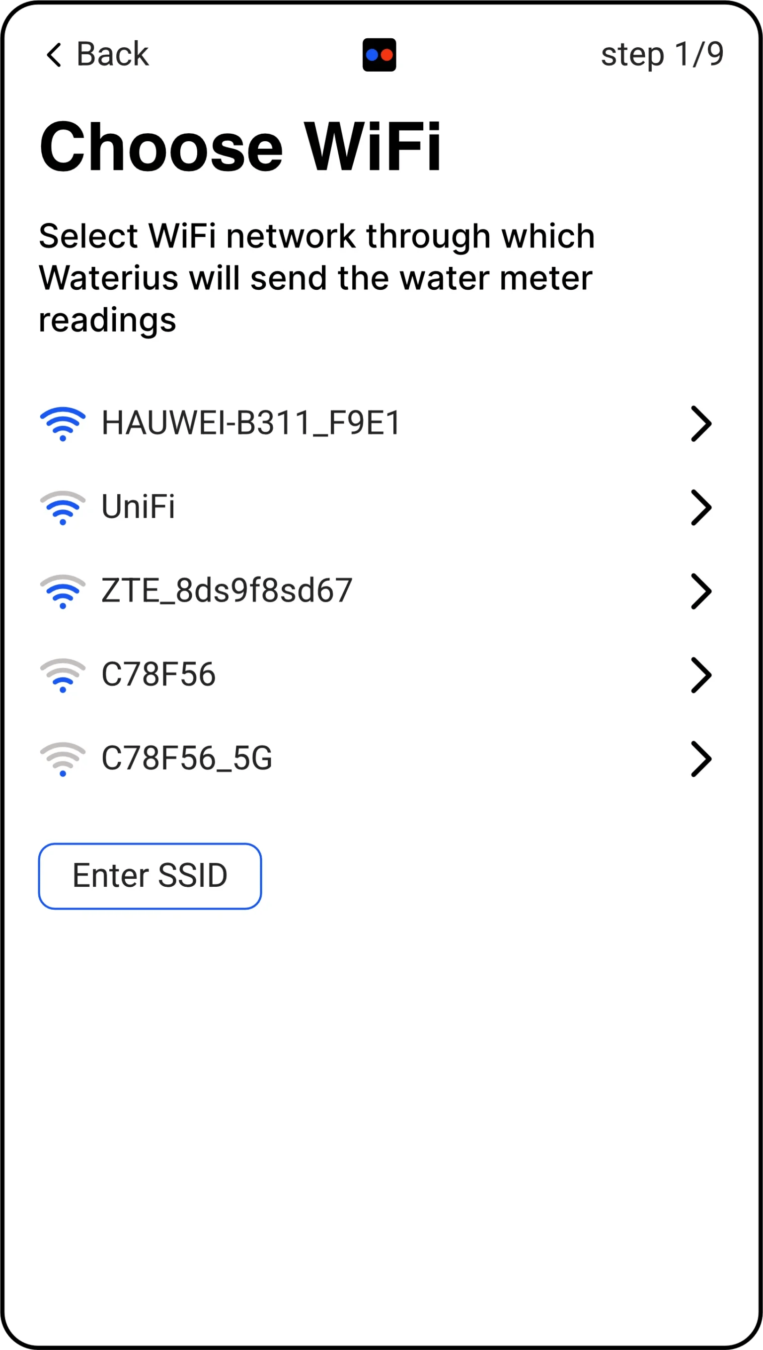
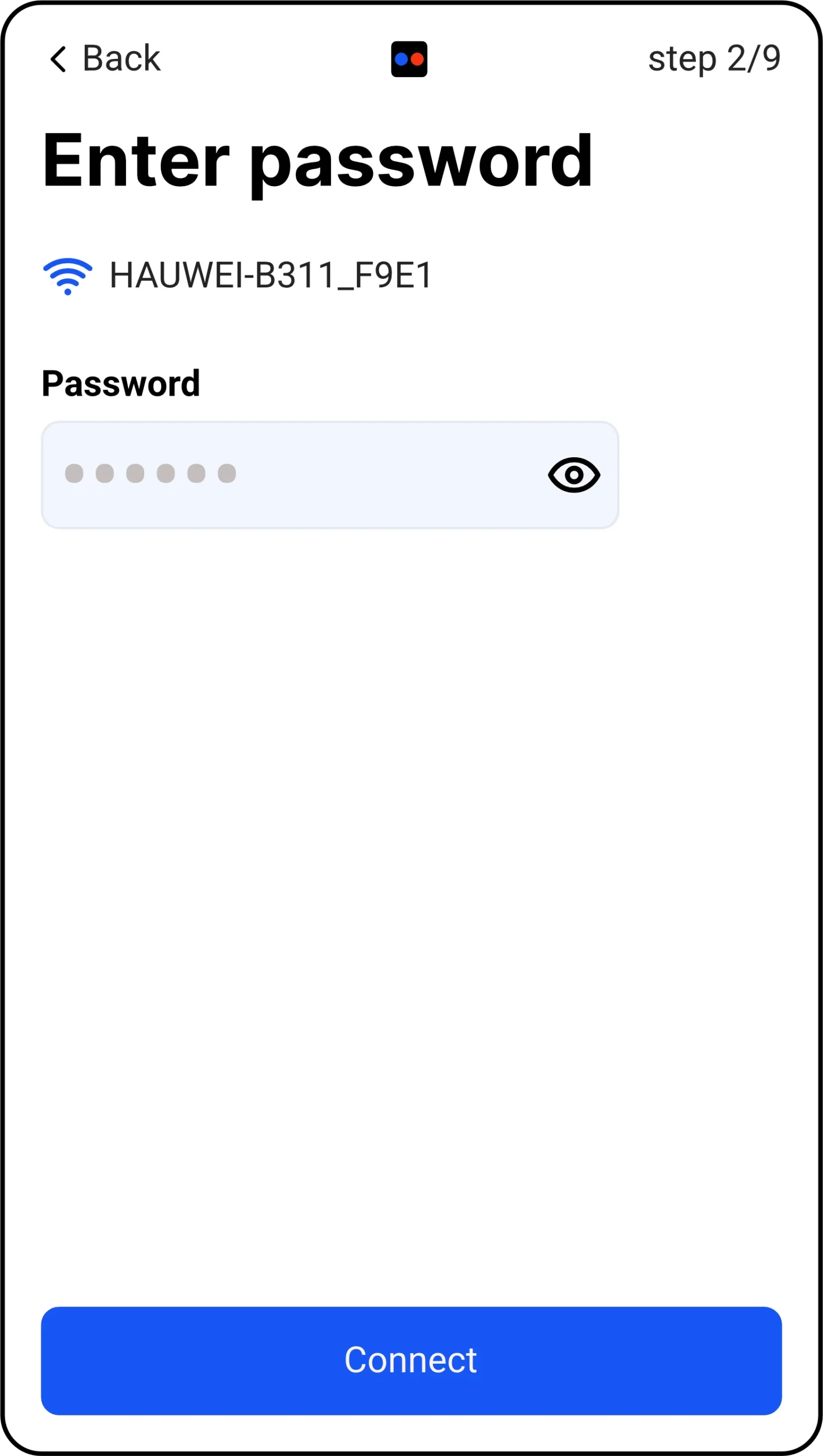
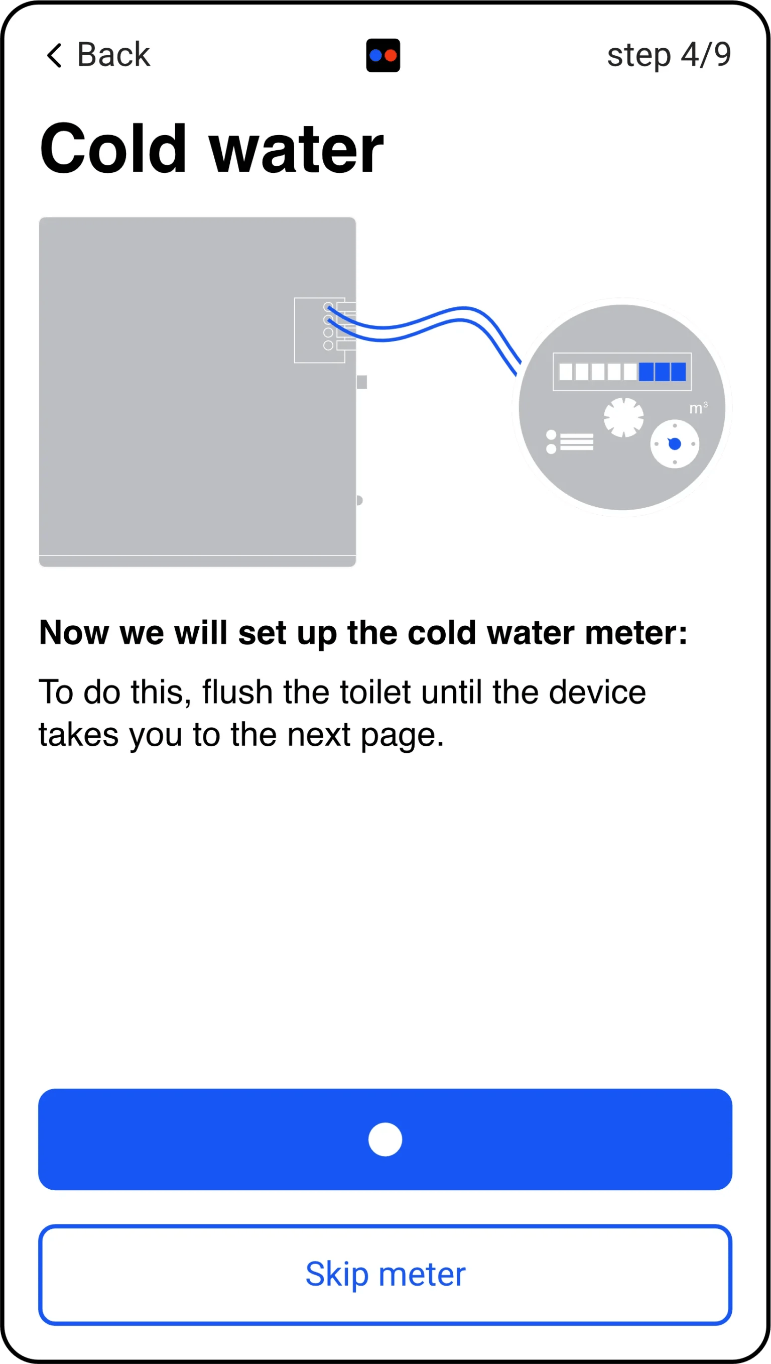
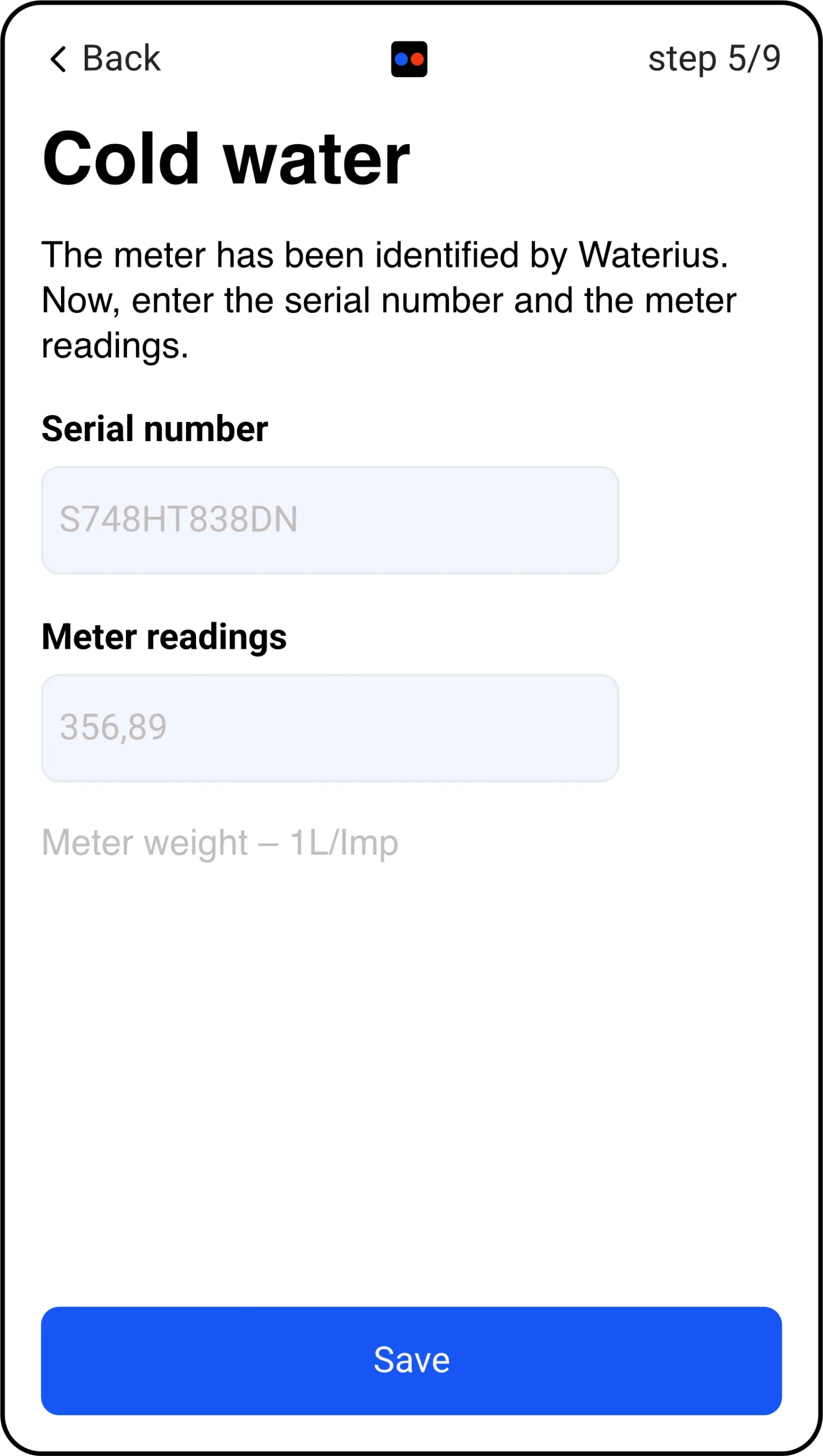
Mapping the conversation.
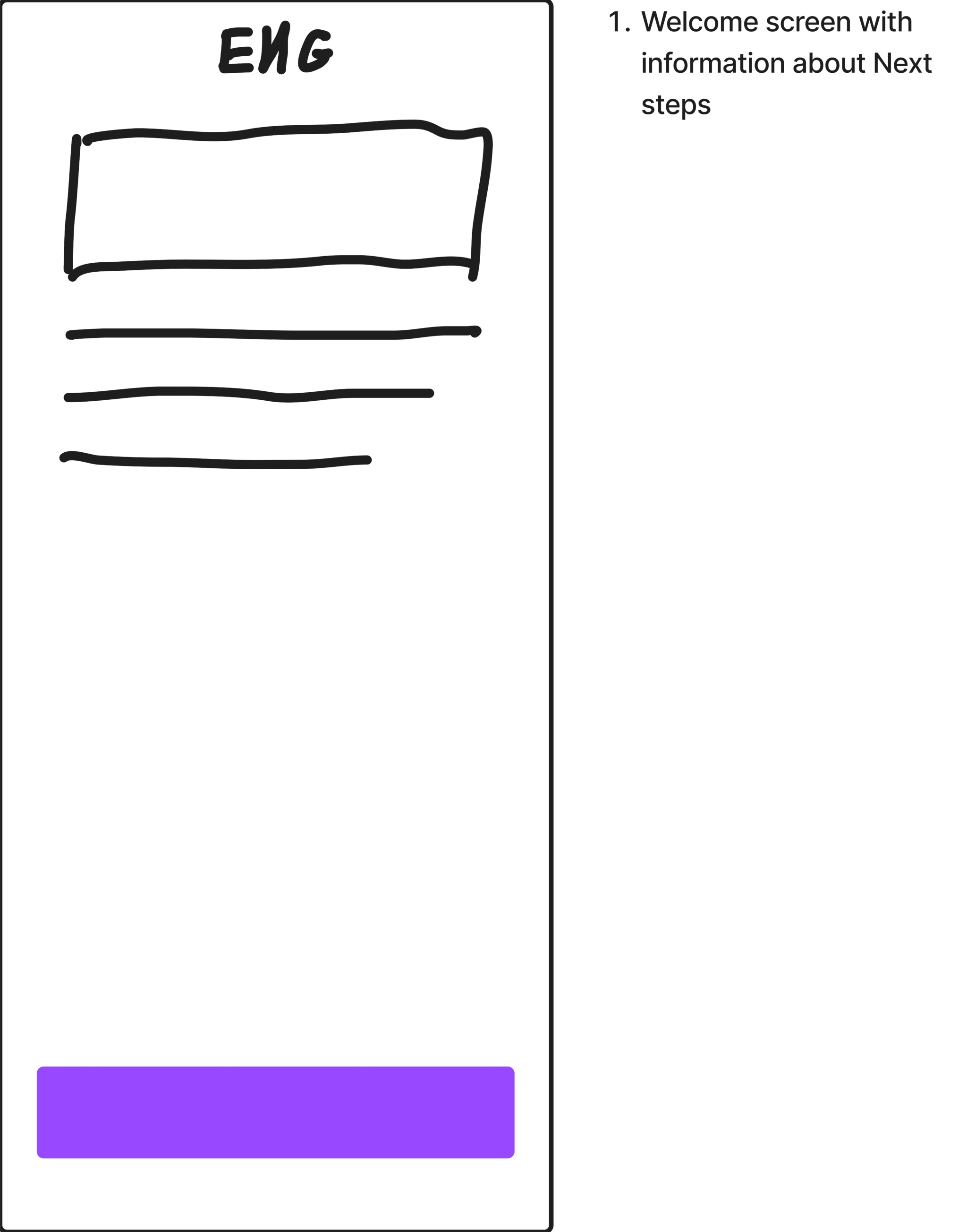
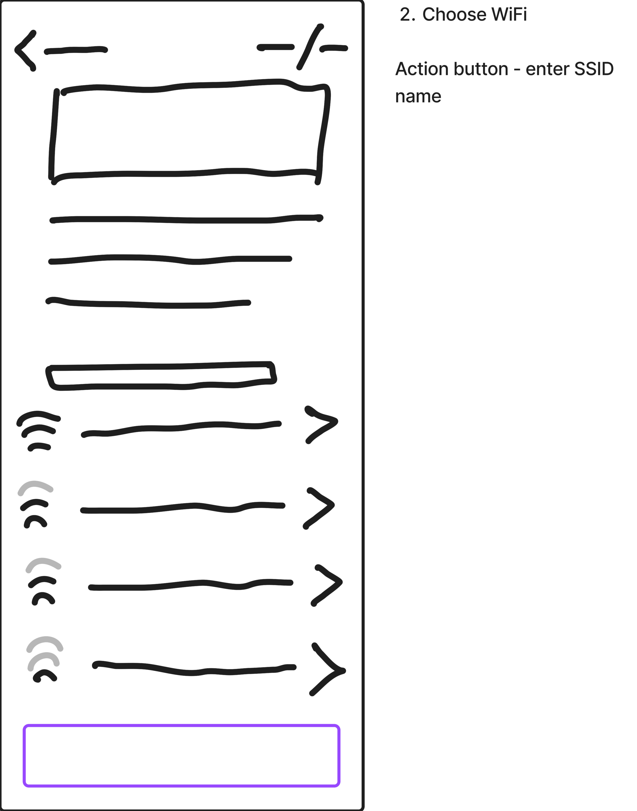
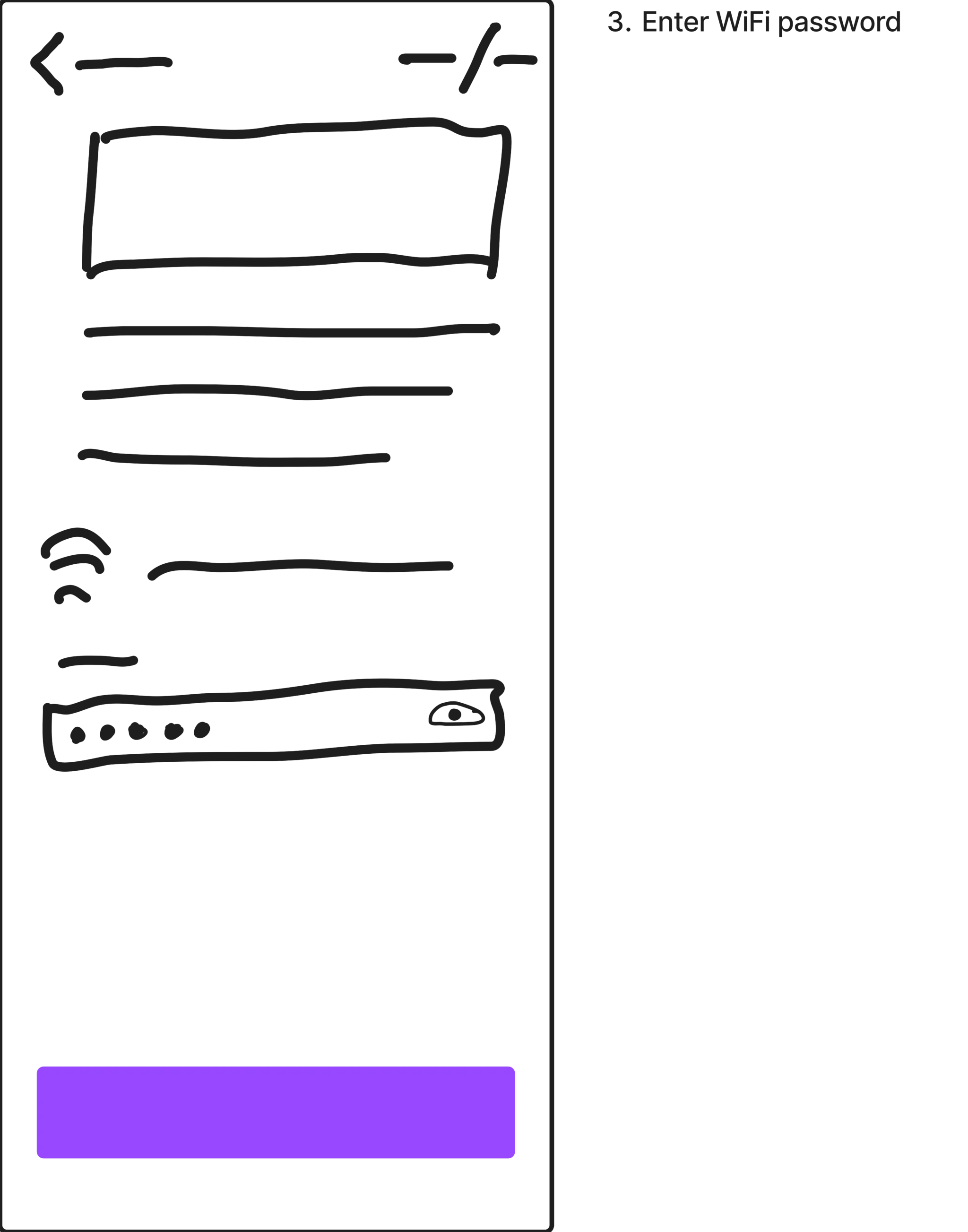
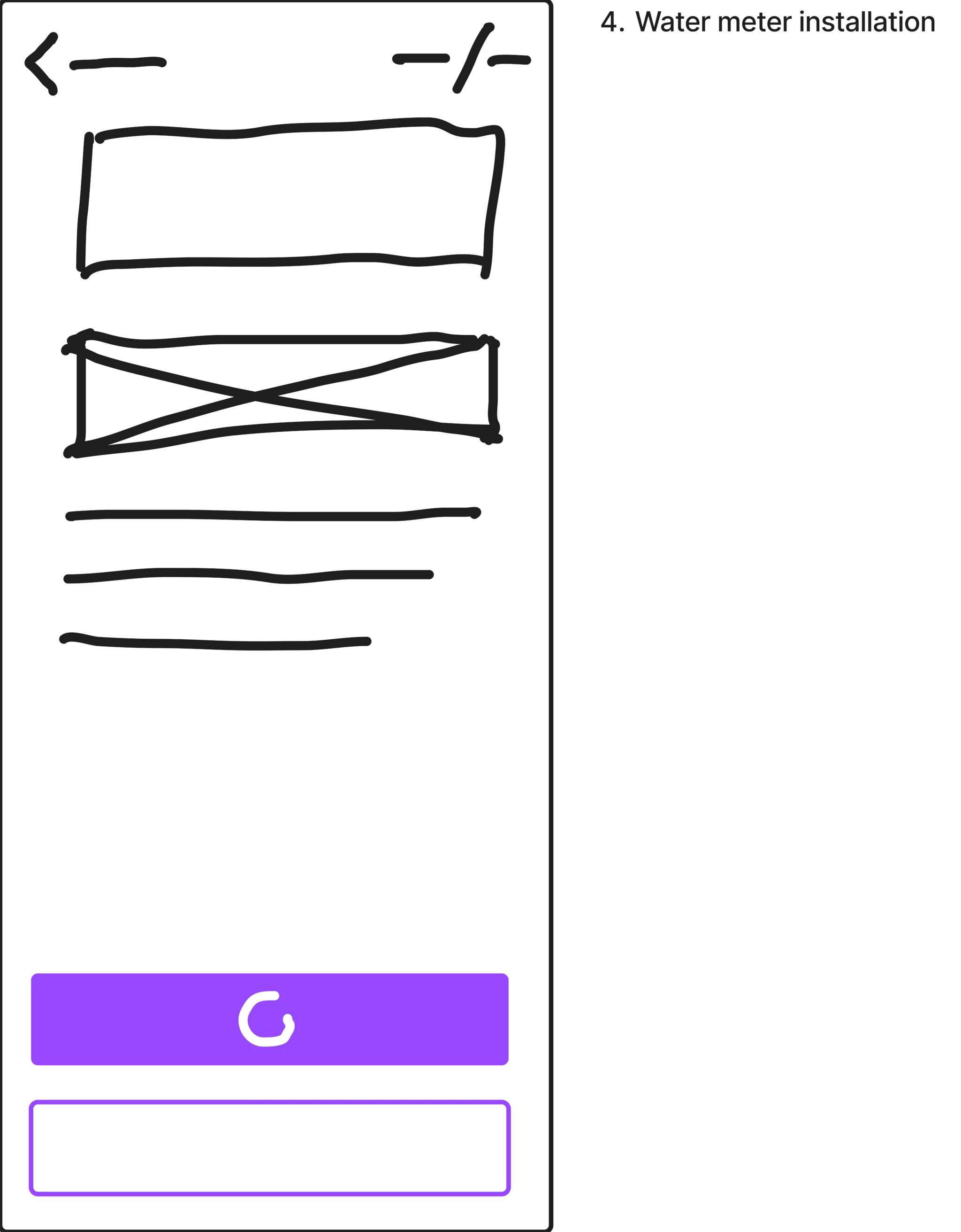
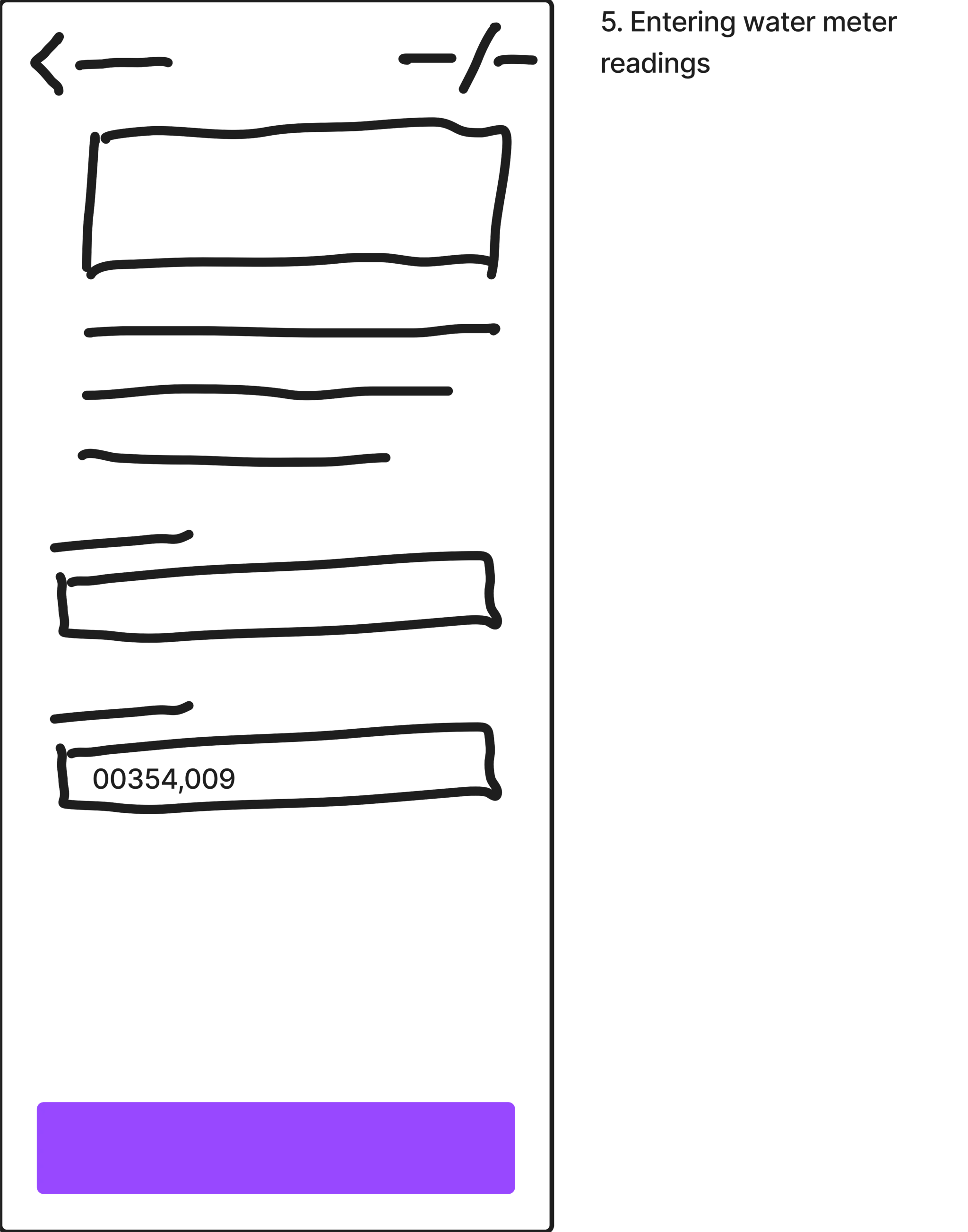
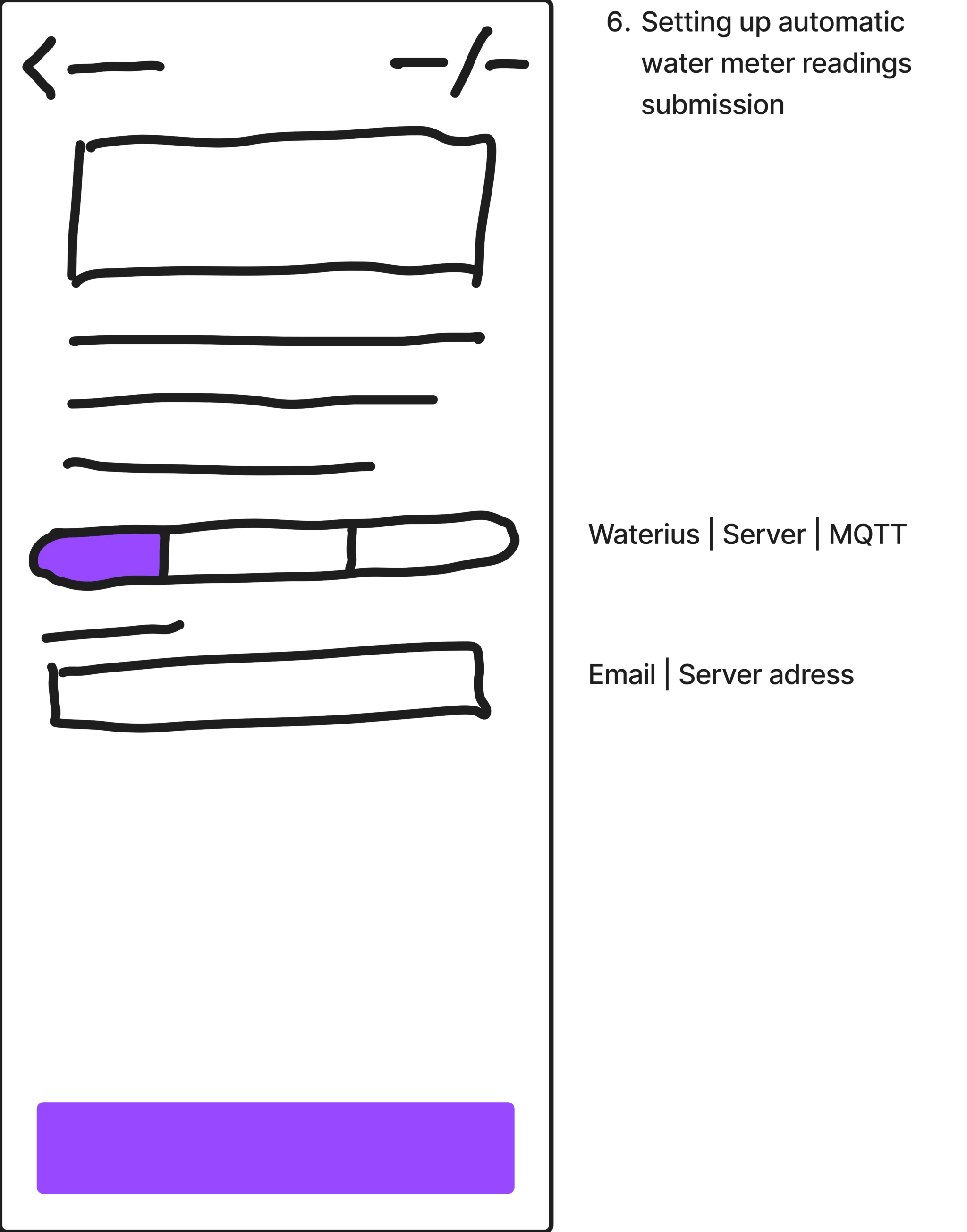
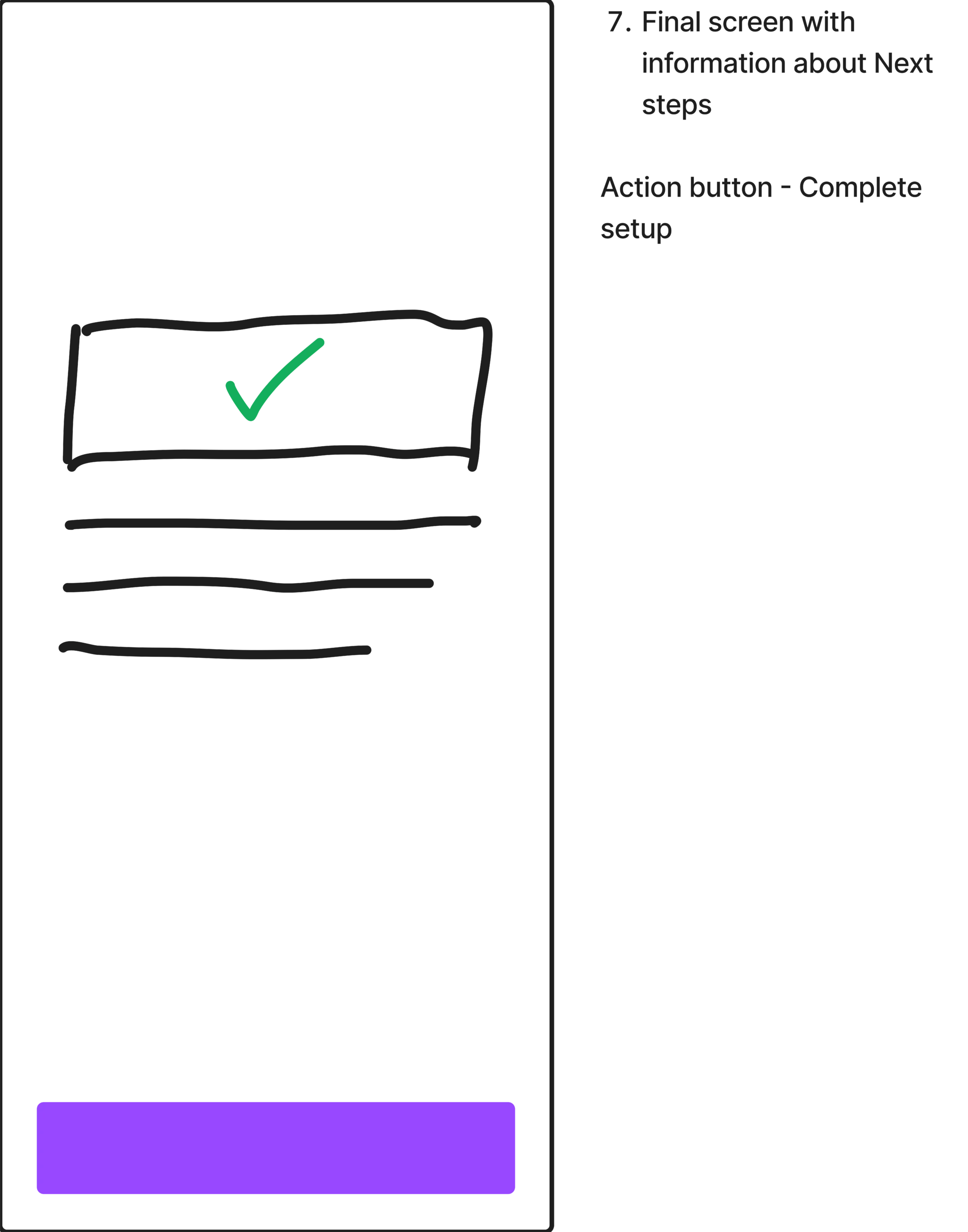
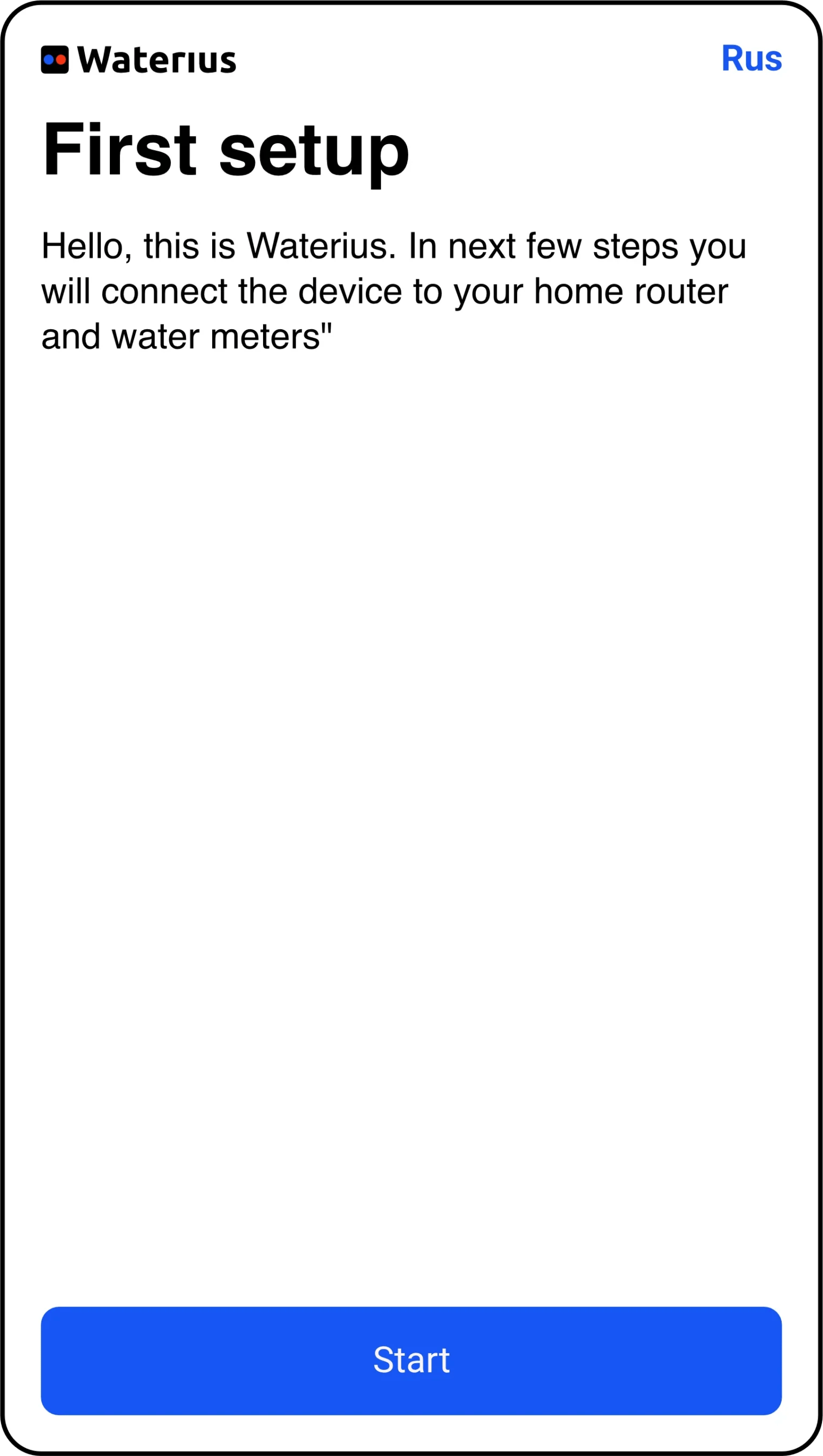
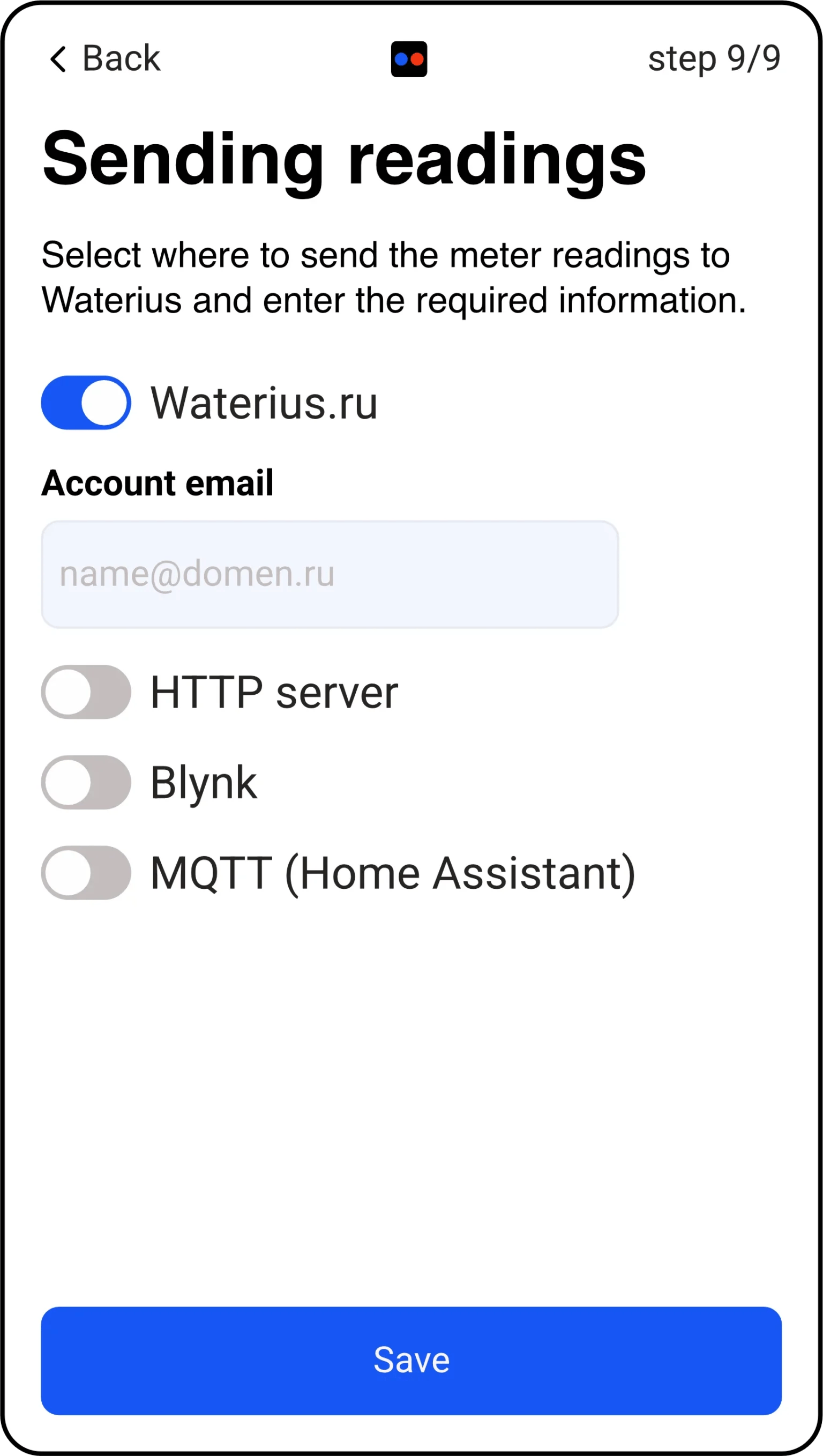
I drew the flow before I drew any screens. Not as a flowchart — as dialogue. What does the app need to know? In what order would a real person volunteer it? Where is the moment they’d give up?The answer was nine steps, one question per step, and an honest welcome screen that says what’s about to happen and how long it will take. The advanced data destinations got moved behind a single toggle, off by default, with a sentence explaining who would want them.