2025 · National bank · 4 months
A national bank was merging six separate online banking products into one. The login screen was the first thing every client would see — and the easiest place to lose them.
Summary
The second national bank, with over 6 million corporate clients, decided to consolidate six online banks into one for small and medium-sized businesses.
Due to security constraints, users must frequently re-login to the bank after a short period, using not only a login and password but also certificates and tokens. This regular process is time-consuming.
The average time to complete the authorization scenario was reduced from 3 minutes to 1, improving business metrics by 57%.
Business
The first week I just sat with support tickets. People weren’t complaining about the design. They were complaining about plugins that wouldn’t install, about errors that said “try again” with no hint of what to try, about being asked for their certificate path on every single login as if the system had amnesia.
Problem
Below: a representative tour. Notice that all five errors look essentially the same, despite being caused by completely different things.
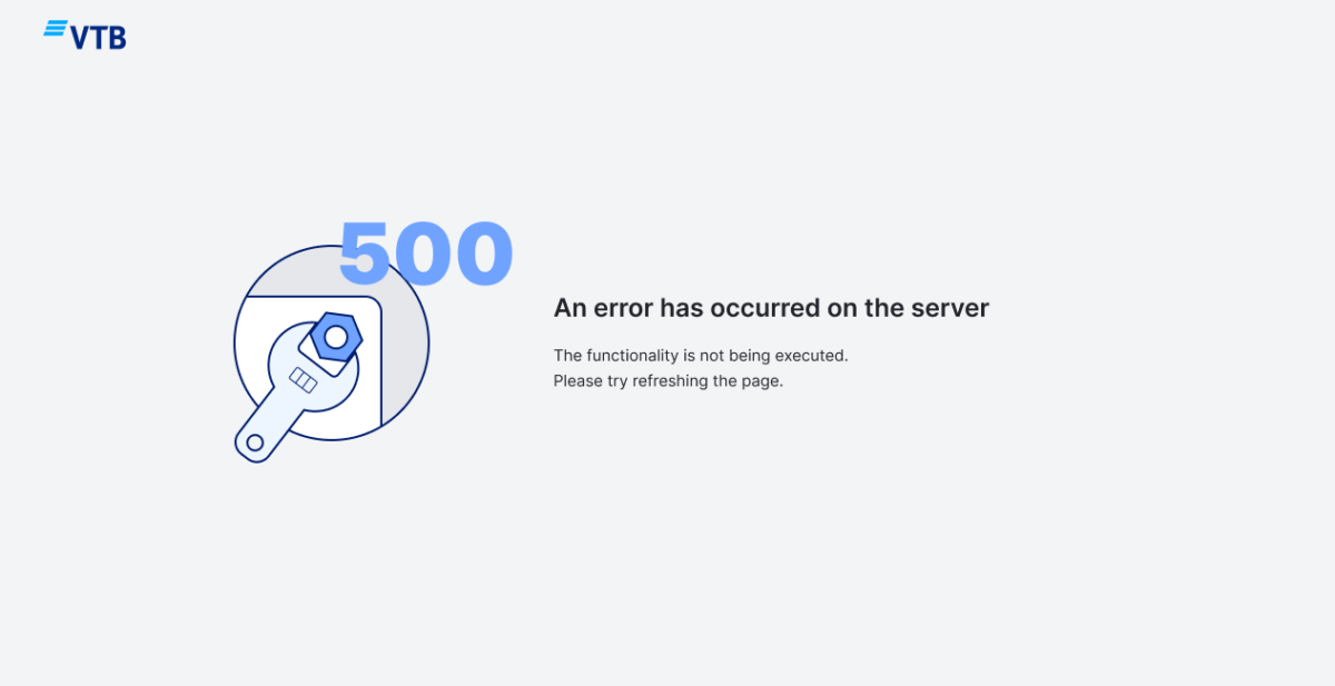
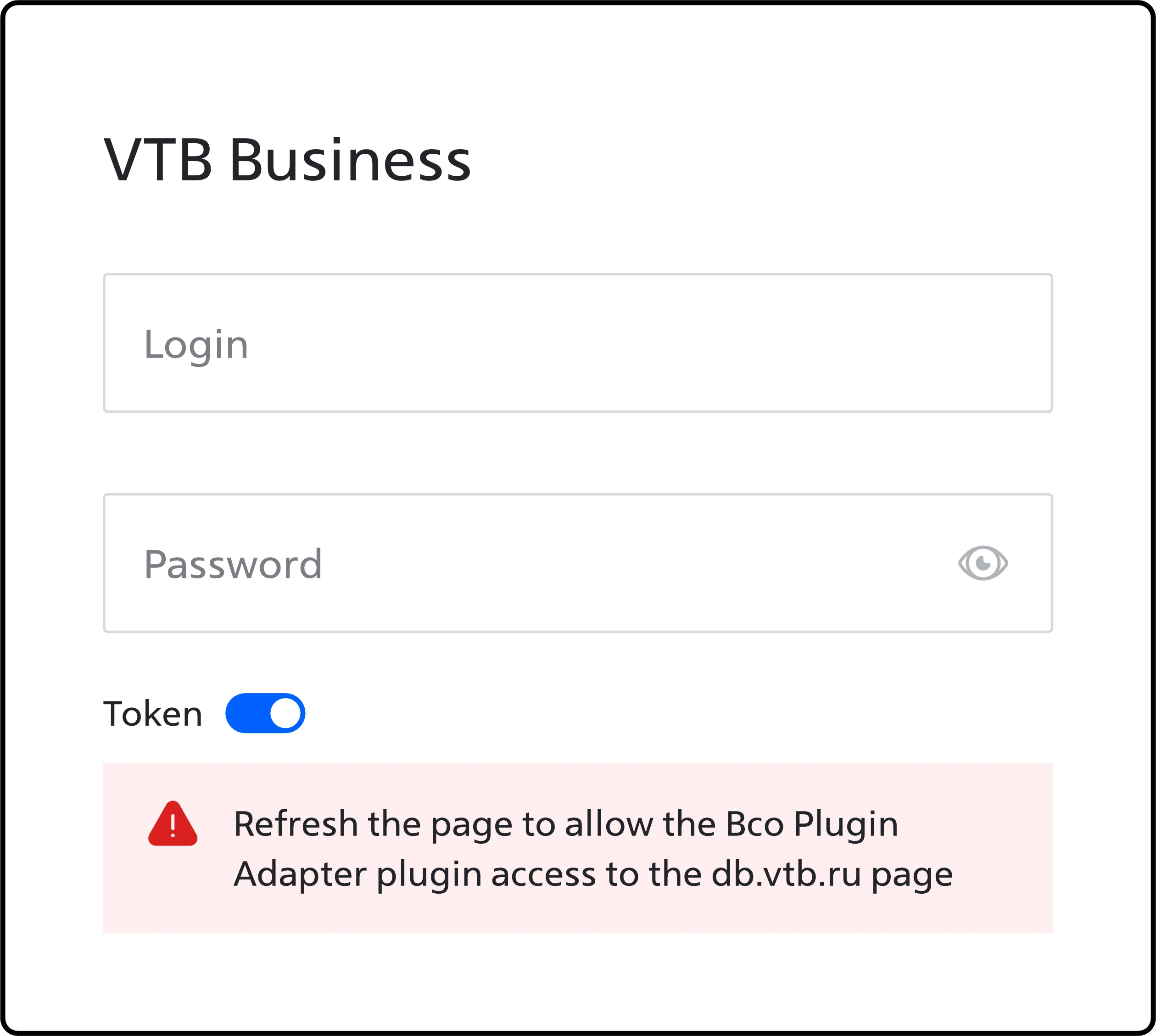
A real screenshot from the live product. The most common error in the system also had the least useful copy.
"Plugin not detected." Detected by what? Installed where? Silence.
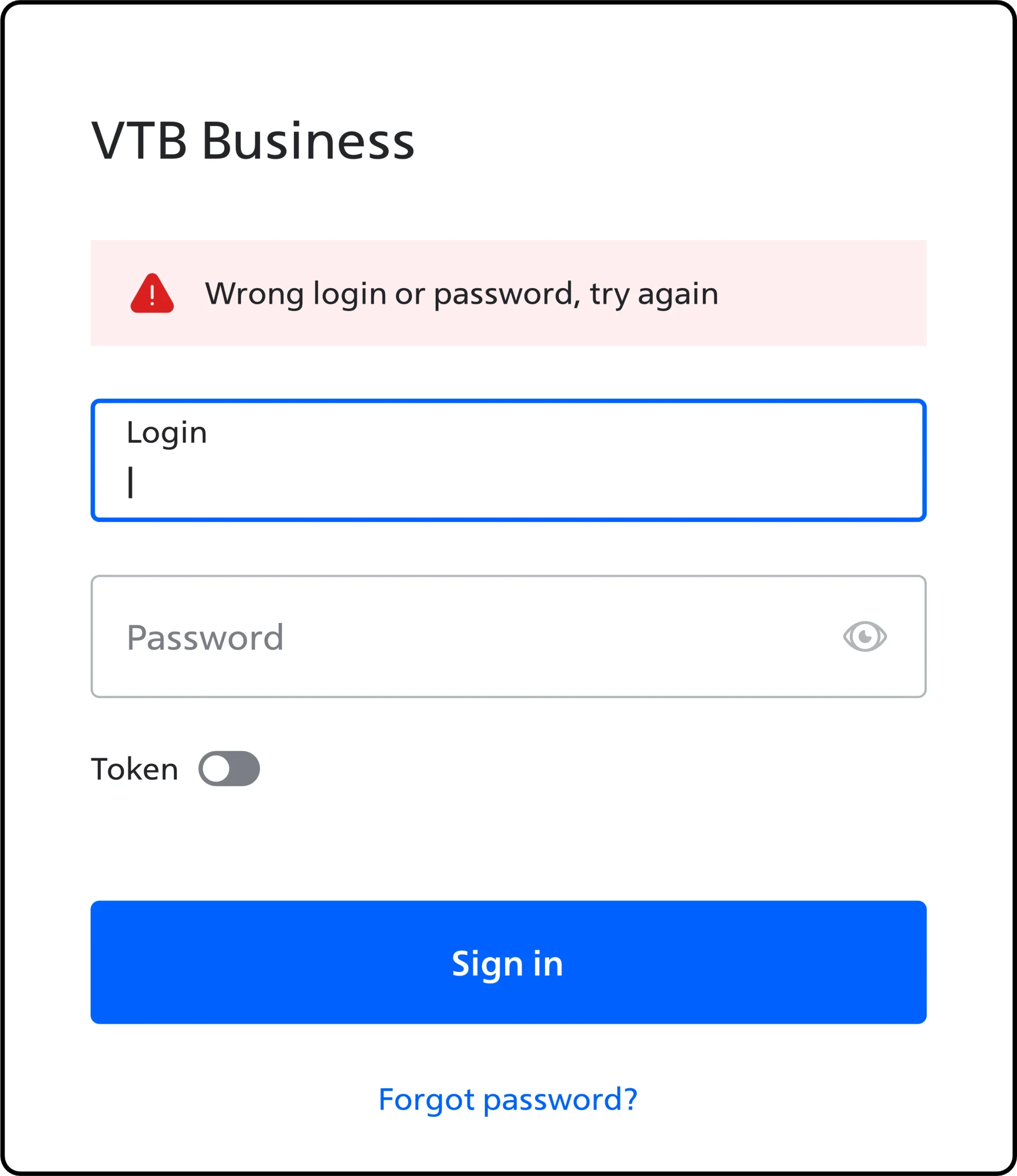
Wrong password — but also clears the login field. Twice as much typing as a punishment.
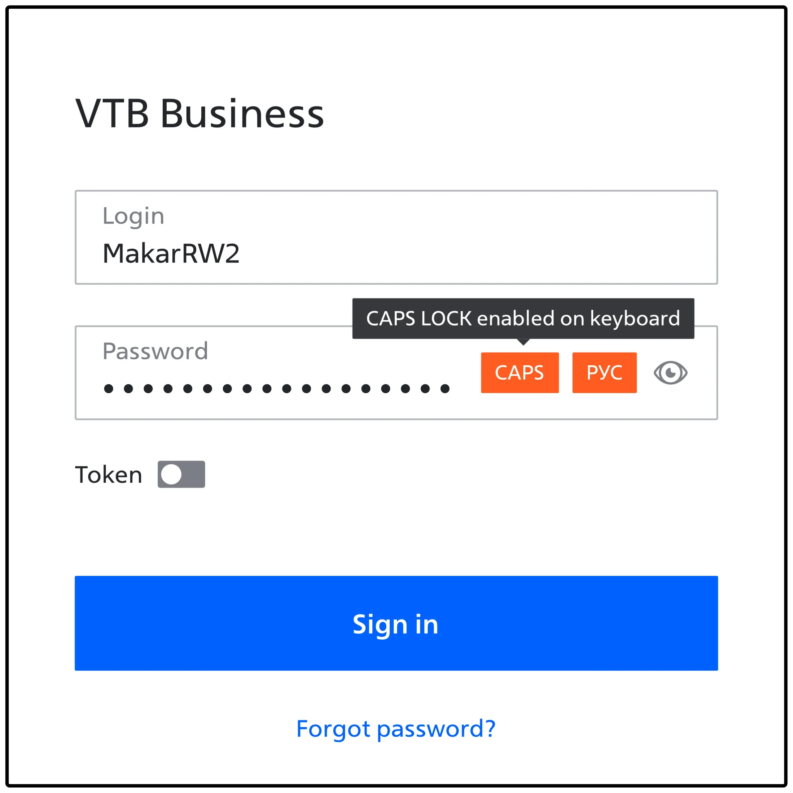
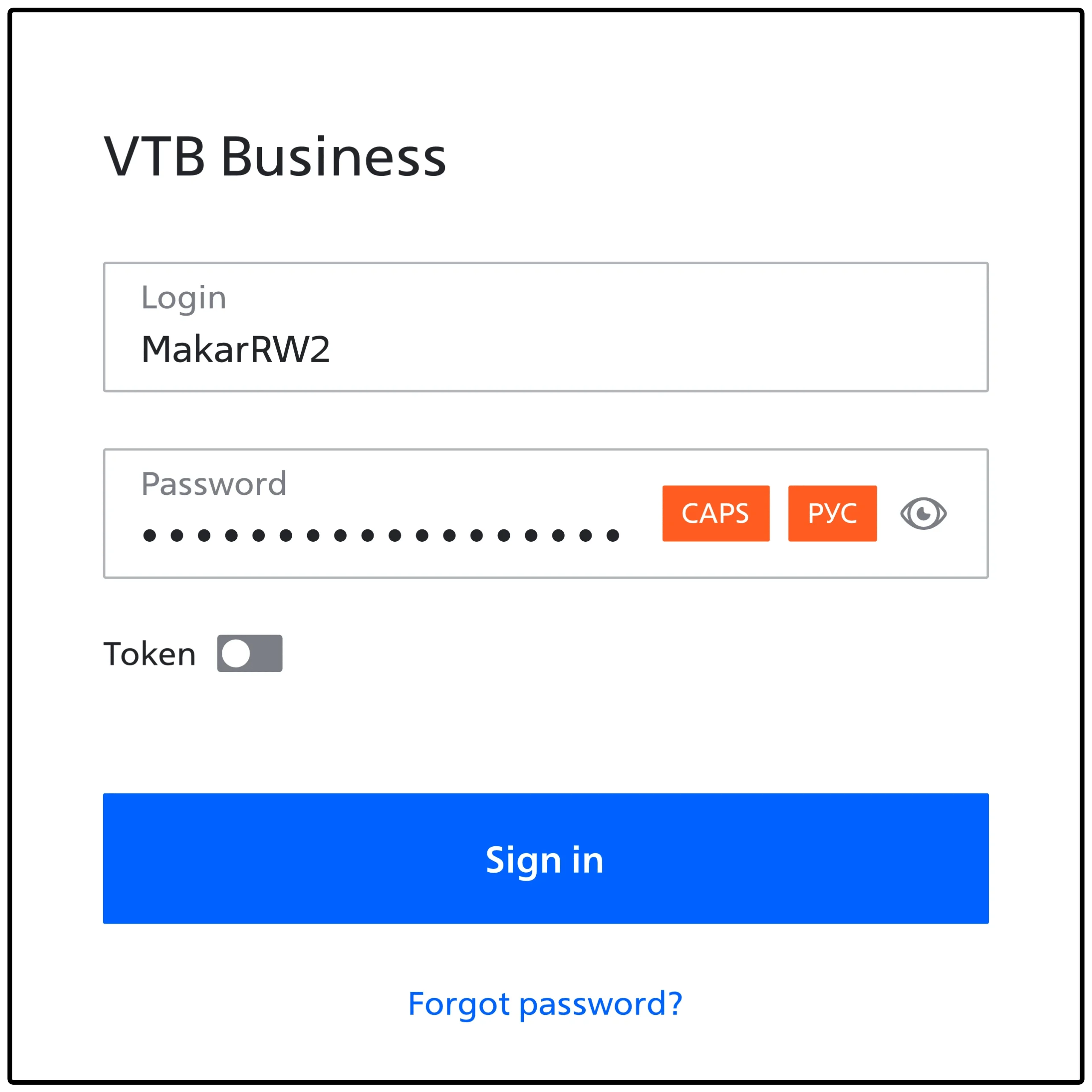
Validation fires on focus, before the user has typed anything. Red before they've done anything wrong.
The path to install the missing plugin is hidden three clicks deep, inside the error itself.
"Please refresh the page." The number-one piece of advice from a system that should know what is wrong.
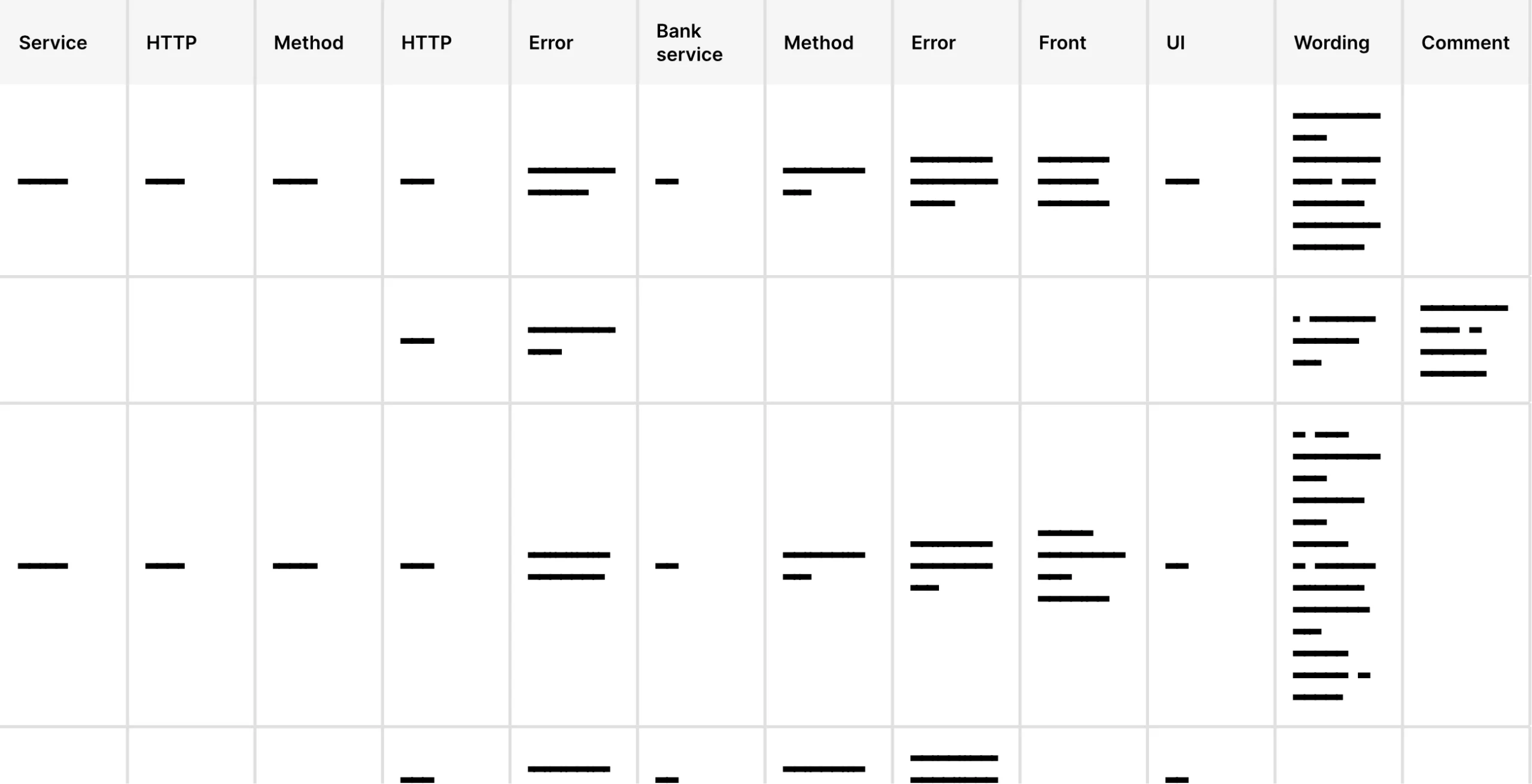
I made a spreadsheet. By the end of week two it had 41 rows. Every row was a state the user could land in, indexed by what triggered it (front-end, back-end, browser, hardware), what the user saw, and what — if anything — they could actually do about it. This spreadsheet ended up being the most valuable artifact of the whole project.
Solution
Empty state. Two fields, one toggle for 'use certificate'. Everything else hidden until needed.
Toggle on, certificate path appears, pre-filled from last session. The user confirms; they don't re-type.
Credentials in, token auto-resolved. The "Sign in" button activates the moment all conditions are met — no separate "check token" step.
Impact
The thing I’m proudest of isn’t the screens. It’s the error table. It outlived the project. The teams now use it as a contract: any new error has to be added to the table, with copy, recovery action, and an owner, before the PR is merged.
57%
Faster median login on the new flow vs. legacy.
6M
Business clients eventually moved onto the unified flow.
41
Edge cases mapped, copy-checked, and assigned an owner.
Credits
Solo product designer. Wrote the error copy. Owned the spec.
Three front-end engineers, two back-end engineers, a product owner, and the bank's security team — who, fairly, said no to roughly a third of my first ideas.
Figma, a 41-row spreadsheet, and a lot of conversations with people who answer support tickets for a living.
The hardest part wasn't the design. It was getting the security team and the front-end team to agree on what counted as a recoverable error. That took two months and a whiteboard.